Curiosity is not gullibility. A short clip can be worth following even when its claims are extraordinary, because the act of tracing a claim back to its source teaches us how information moves. That was the case with a viral Instagram Reel that referred to a chart about British royal lineage, Rothschilds, Winston Churchill, Queen Elizabeth II, and an alleged hidden king narrative.
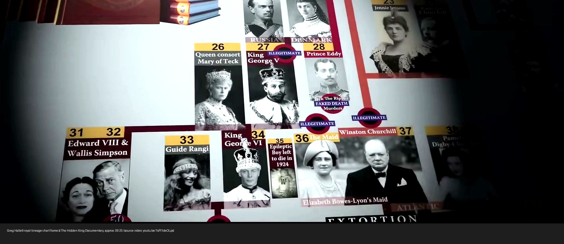
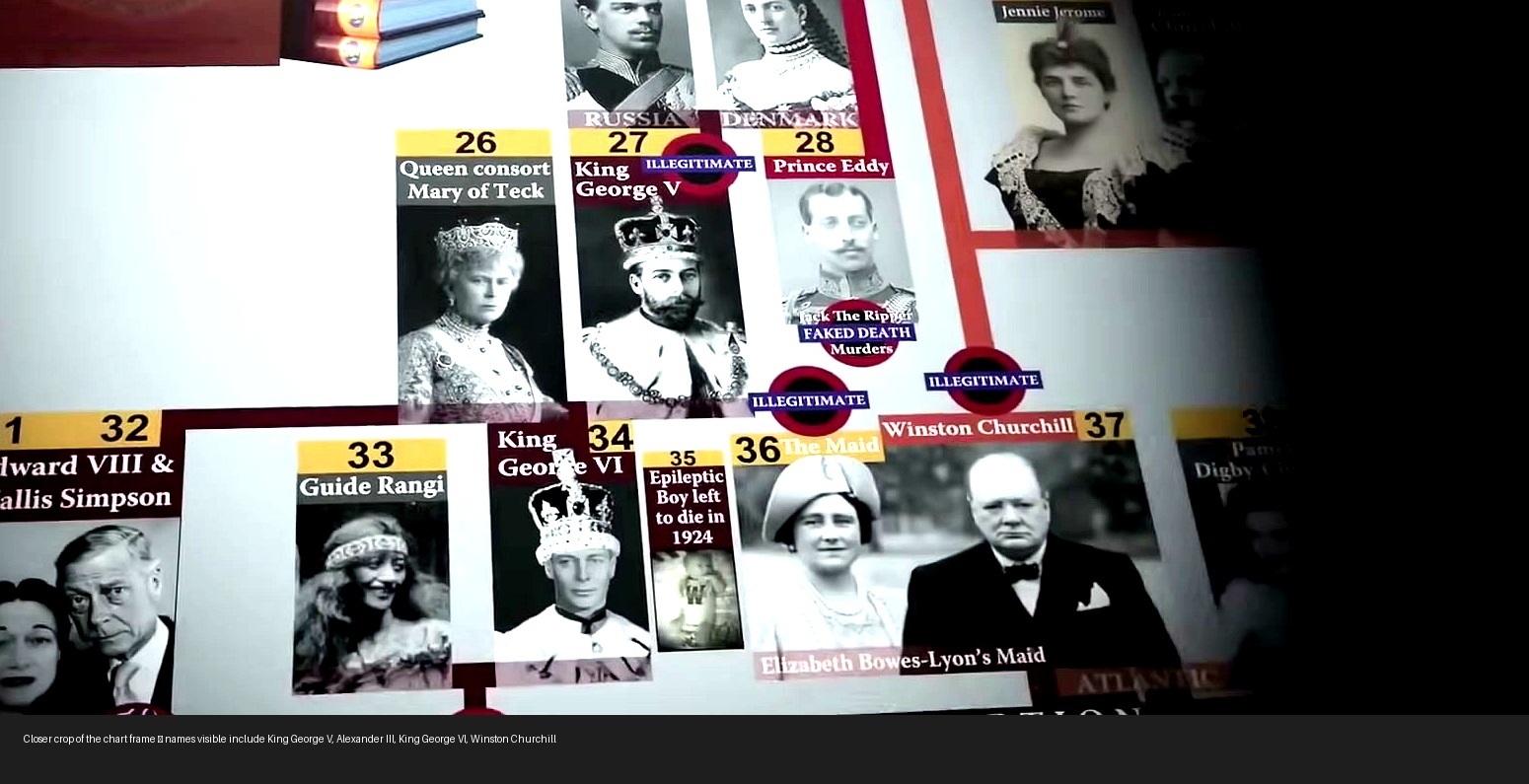
The first job was simple: find the chart. The better job was more important: identify where the chart came from, what it was claiming, and what should not be inferred from it. The source trail led to the YouTube video The Hidden King Documentary | Joseph Gregory Hallett, a mirrored documentary uploaded by John Lovell. Around the nine-and-a-half-minute mark, the speaker says the royal-family story is becoming “too much,” then says, “I’ll show you a chart.” The narration describes Greg Hallett as producing a chart that shows “a surprisingly different narrative of the royal lineage we’ve all become accustomed to.”
What the chart actually is
The chart is not an official family tree and not a document from a recognized archival or genealogical authority. It is a visual artifact from Greg Hallett / Joseph Gregory Hallett material. The surrounding transcript makes several extreme claims: that the British royal family has been “flatly royal,” that the Rothschild family allegedly had “breeding rights” to the British royal family, that King George V was allegedly sired by Tsar Alexander III, and that Queen Elizabeth II was allegedly sired by artificial insemination by Winston Churchill. Those claims are presented in the documentary; the video frame preserves what was said and shown. Preservation is not verification.
Managing Expectations rule
A chart can document what a claimant believes or wants viewers to believe. That does not make the chart evidence that the claim is true. Treat the chart as a source artifact, then ask what independent evidence supports each assertion.
Why curiosity still matters
There is a temptation to handle material like this in one of two lazy ways. One lazy response is to share the chart as if it unlocks hidden history. The other lazy response is to refuse to look at it at all because the claims sound absurd. Neither response builds good judgment.
The disciplined path is to follow the thread far enough to locate the source, preserve the artifact, and classify the claim. In this case, the classification is straightforward: it is an alternative royal-lineage conspiracy claim. It belongs in the category of viral claim literacy, not confirmed history. The chart is useful because it shows the structure of the story being sold: familiar names, arrows, illegitimacy labels, royal titles, and an implied legal narrative. The visual format gives the claim an appearance of order. But order on a page is not proof in the world.
The difference between a source trail and a proof trail
A source trail answers: Where did this come from? A proof trail answers: Is it true? The first can often be solved with transcripts, frame extraction, image matching, archived pages, and timestamps. The second requires independent documents: civil records, contemporaneous correspondence, recognized biographies, DNA evidence where relevant and lawful, court-tested records, and professional genealogical work.
For this chart, the source trail is solid enough: the chart appears in the Hallett documentary at approximately 09:20–09:30. The proof trail is not established by the chart. The documentary makes claims. The chart visualizes those claims. It does not independently prove them.
How to read charts like this
Start with humility. A chart can be impressive, but it can also smuggle unsupported leaps into a diagram. Ask four questions. First, who made it? Second, what primary documents are attached to each arrow? Third, are the claims testable by independent records? Fourth, does the chart distinguish confirmed relationships from speculation, allegation, interpretation, and symbolism?
Those questions are especially important when a claim combines monarchy, finance, religion, hidden bloodlines, intelligence, prophecy, legal estoppel, or global shutdowns. Each additional layer can make a story feel more comprehensive while making it harder to verify. A serious reader slows down exactly where the story tries to accelerate.
What was preserved
- The source video metadata and transcript were saved for audit.
- The relevant transcript window was preserved around the “I’ll show you a chart” moment.
- An enhanced full-frame copy, close crop, and contact sheet were created from the source video.
- The direct source timestamp is linked below so readers can inspect the context themselves.
Open the source-frame contact sheet.
Bottom line
The chart is real in the limited sense that it appears in the source documentary and can be copied from the video frame. The claims inside the chart are not verified by that fact. The healthier posture is serious curiosity: find the source, preserve the evidence, state the claim accurately, and refuse to confuse a compelling diagram with proof.
Source links
- Source video: The Hidden King Documentary | Joseph Gregory Hallett
- Direct chart timestamp: approx. 09:20 in the source video
- Local source note: research note and extraction summary
- Transcript archive: retrieved transcript
- Metadata archive: retrieved YouTube metadata
Evidence literacy over instant belief
Managing Expectations treats viral clips as leads. A lead can be interesting before it is true. The job is to keep those categories separate.
Back to Blog